History of Disco and Dance Music: a Jupyter notebook
I wanted to see how well OpenAI's ChatGPT would work for teaching, so I asked it to design a Jupyter course. The first assignment it gave me was to explore the history of disco and dance music. I need to use both text and images to describe the key developments and important figures in the genre.
I’m not sure Jupyter notebooks are the best choice here because there’s no data analysis, but I’m not an AI so…
Getting started
To get started, I create a folder for my Jupyter experiments, add a .gitignore from Toptal, and create a simple README. I also set the license as MIT.
❯ mkdir jupyter
❯ cd jupyter
❯ curl -L https://www.toptal.com/developers/gitignore/api/python,visualstudiocode,jupyter > .gitignore
❯ code README.md
[writes some text]
❯ git init
❯ git add -a && git commit -m "initial commit"
Then I create a python virtual env, install jupyter and run it:
❯ python -m venv .venv
❯ pip install jupyter
...
❯ jupyter notebook
That opens a web page in my browser. I click “New,” and create a folder called “History of disco and dance music.” Inside the folder, I create a notebook called “History of disco and dance music.ipynb” and save it. My folder structure looks like this:
.
├── History of disco and dance music
│   └── History of disco and dance music.ipynb
└── README.md
I’m ready to start coding.
Importing text from Wikipedia
To add text from Wikipedia, I can install the Wikipedia package and put this code in a cell:
import wikipedia
wikipedia.summary("Disco music", sentences=2)
"Disco is a genre of dance music and a subculture that emerged in the 1970s from the United States' urban nightlife scene. Its sound is typified by four-on-the-floor beats, syncopated basslines, string sections, horns, electric piano, synthesizers, and electric rhythm guitars."But I’d rather copy and paste it as Markdown so I can format it.
Extracting time information from text
A better way to use the Wikipedia Python API is to generate timeline events. I struggled getting someting useful from ChatGPT (regular expressions?? 🙄) but eventually we found a decent solution using SpaCy. But first, I have to download the language set with a bash command, something that ChatGPT had no idea about
!python -m spacy download en_core_web_sm > /dev/nullThe > /dev/null is a way to ignore all the noise - it’s a very noisy command. Now I can start using it.
import wikipedia
import spacy
nlp = spacy.load('en_core_web_sm')

text = wikipedia.page("Disco music").content

# Parse the text using spaCy
doc = nlp(text)

# extraxt the actual year from the token
re_year = re.compile(r"([12][90]\d\d)")

# Iterate over the entities in the document
for entity in doc.ents:
  # Check if the entity is a date
  if entity.label_ == 'DATE':
    # Print the date and the associated text
    try:
        year = re_year.search(entity.text).group(1)
    except BaseException:
        year = entity.text
    print(f"{year},1,1\t{entity.text}\t{entity.sent.text}")
    print('-----------------------------------')
1970,1,1 the 1970s Disco is a genre of dance music and a subculture that emerged in the 1970s from the United States' urban nightlife scene.-----------------------------------
1960,1,1 the late 1960s Disco started as a mixture of music from venues popular with Italian Americans, Hispanic and Latino Americans and Black Americans in Philadelphia and New York City during the late 1960s and early 1970s.
-----------------------------------
1970,1,1 early 1970s Disco started as a mixture of music from venues popular with Italian Americans, Hispanic and Latino Americans and Black Americans in Philadelphia and New York City during the late 1960s and early 1970s.
-----------------------------------
...
-----------------------------------
1964,1,1 July 12, 1964 The earliest known use for the abbreviated form "disco" described this dress and has been found in The Salt Lake Tribune on July 12, 1964, Playboy magazine used it in September of the same year to describe Los Angeles nightclubs.
-----------------------------------
...This will need some manual cleaning up, but at least it makes sense in a Jupyter notebook. I go through all the lines in the texts, and selectively copy those that seem useful, cleaning up the text. I save it to a tsv file, timeline.csv, ready to be imported into the notebook. It is available on github, but it’s rather short, as the futility of this task became quickly apparent.
Displaying a timeline of events in Python with matplotlib
Creating a timeline of events in Python with matplotlib is a terrible idea. The best I could come up with was this, but getting there was painful.
To run matplotlib in the notebook, I enabled it with %matplotlib inline:
import matplotlib.pyplot as plt
from datetime import date
import numpy as np

%matplotlib inline
I load the tsv file with pandas:
import pandas as pd
import numpy as np
df = pd.read_csv('./timeline.tsv',sep = '\t')
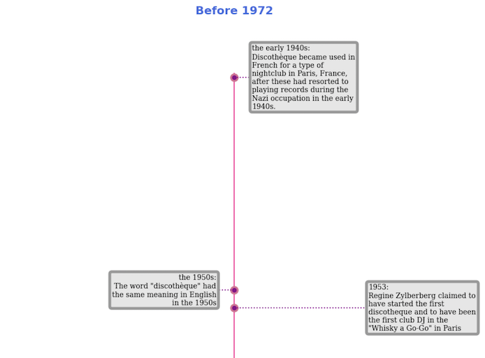
...When experimenting with the graph, I found that the events were not evenly spaced out. If I made the space too large, the start of the timeline looked empty, and if it was too small, all of the events overlapped. I solved this problem by generating separate timelines for different periods with different settings for each:
sub_timelines = [{
    "smaller_than": "1971,06,01",
    "larger_than": "1900,06,01",
    "figsize": 16,
    "title": "Before 1972\n\n"
    },{
    "smaller_than": "2100,06,01",
    "larger_than": "1971,06,01",
    "figsize": 40,
    "title": "From 1972 onwards"
    }
]

for sub_timeline in sub_timelines:
    ...
At the start of each iteration, I need to create a pandas dataframe by extracting only the rows I’m interested in. This is what the “smaller_than” and “larger_than” in the settings are for. It was tricky to do, and I couldn’t get any help from ChatGPT. If you have a dataframe df, you can filter it by using a condition like df[ df[date] < '2020,02,03' ]. But if you have multiple conditions with an ‘and’ or an ‘or’, like df[ df[date] < '2020,02,03' and df[date] > '1800,02,03' ], it breaks with the error message “The truth value of a Series is ambiguous. Use a.empty, a.bool(), a.item(), a.any() or a.all()“. This means that pandas doesn’t like ‘and’ and ‘or’ because it expects booleans on either side. Pandas is written in C under the hood, after all. Using bitwise ’&’ should work, but it doesn’t in this case because pandas doesn’t treat the result of df[date] > '1800,02,03' as a boolean, but as a string. I don’t understand it either. The solution is to wrap the conditions with numpy.logical_and:
for sub_timeline in sub_timelines:
    subset_df = df[np.logical_and(
        sub_timeline["larger_than"] < df['date'], df['date'] <= sub_timeline["smaller_than"]
        )]
    dates=[date(*[int(c) for c in cell.split(",")]) for cell in subset_df['date'].to_list()]
    min_date = date(np.min(dates).year - 2, np.min(dates).month, np.min(dates).day)
    max_date = date(np.max(dates).year + 2, np.max(dates).month, np.max(dates).day)
I convert the dates column to a list with df['date'].to_list(), and then convert it all to date objects. min_date and max_date are needed for working out the ranges of the graph.
Wrapping text in text labels in matplotlib
…is not possible. Instead, it shrinks the text to fit it in the label. This is frustrating and limits the usefulness of the library. I had to create my own text wrapping function:
# manually wrap the text into lines of max_line_length
    labels = []
    for label in subset_df['text'].to_list():
        lines = [];
        words = label.split(" ")
        line = words.pop(0)
        while words:
            next_word = words.pop(0)
            potential_next_line = f"{line} {next_word}"
            if len(potential_next_line) <= max_line_length:
                line = potential_next_line
            else:
                lines.append(line)
                line = next_word
        if line:
            lines.append(line)
        labels.append("\n".join(lines))
    date_labels = subset_df['date_label'].to_list()

    # prepend label with display date
    labels = [f"{l}:\n{t}" for l, t in zip (date_labels, labels)]
The source data fields are date, date_label, text, where date is a tuple that is used to generate a date object, and date_label is a human-friendly version of the date. I prepend the date_label to the text box, but there is no easy way to make it bold without also making the rest of the text bold. Overall, text wrapping in matplotlib is a major limitation of the library.
A simple scatter graph for a timeline
The graph itself is quite uneventful. It’s a one dimensional scatter graph. Basically, a line (ax.axvline) with some dots along it (ax.scatter)
    fig, ax = plt.subplots(figsize=(8, sub_timeline["figsize"]))
    _ = ax.set_ylim(max_date, min_date)
    _ = ax.axvline(0, ymin=0.05, ymax=0.95, c='deeppink', zorder=1)
    _ = ax.scatter(np.zeros(len(dates)), dates, s=120, c='palevioletred', zorder=2)
    _ = ax.scatter(np.zeros(len(dates)), dates, s=30, c='darkmagenta', zorder=3)
Adding labels to the timeline graph
The most important part of the graph, the text, is not really a graph, it’s just some labels that appear at the right place. They are all offset with respect to the line in the middle. It alternates between far from the line and near the line, on either side of it, making it a cycle of four. I use the .text component for it, but the .annotation works equally well.
    label_offsets = np.repeat(4.0, len(dates))
    label_offsets[2::4] = max_line_length + 2.0
    label_offsets[3::4] = max_line_length + 2.0
    label_offsets[1::2] *= -1.0
    for i, (l, d) in enumerate(zip(labels, dates)):
        align = 'right'
        if i % 2 == 0:
            align = 'left'
        _ = ax.text(label_offsets[i], d, l, ha=align, fontfamily='serif',
                    bbox=boxdic, verticalalignment='center',fontsize=10)
Joining the labels to the graph with lines
Matplotlib suggests using stems in its example, but they don’t seem to work for horizontal lines. I followed Brad’s advice and used .hlines instead
    # the lines joining the boxes to the main plot
    stems = np.repeat(4.0, len(dates))
    stems[2::4] = max_line_length + 4.0
    stems[3::4] = max_line_length + 4.0
    stems[1::2] *= -1.0
    x = ax.hlines(dates, xmin=0, xmax=stems, linestyles="dotted", color='darkmagenta')
Adding images to the timeline
I decided to stop here. I have suffered enough.
Conclusion
Python is not well-suited for creating timelines of events. Of the main graph packages used with Jupyter, plotly, seaborn and bokeh do not have this functionality built in. Matplotlib can be used to create a timeline. It is not so hard to flip to vertical - someone called Brad had blogged something similar, and that was a very useful starting point. Still, it is better to use Javascript or CSS flex for this task. This was supposed to be a beginner exercise, and integrating JS is way too complicated for that level. Overall, the suggestion to use Python for creating timelines of events is a terrible idea.